Project: UX UI Web Redesign | Role: UX UI Designer and Art Director
Developer: Gary Lee | Photographer: Ria and Jurada Studio
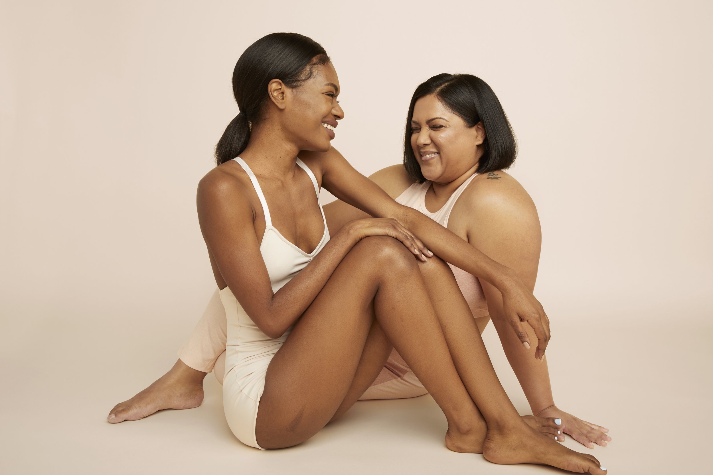
Knours is a beauty company that encourages women to know their skin and understand its relationship with hormonal fluctuations. They believe that ever-changing hormones can potentially disrupt and alter skin’s state of being, especially during the 3 M’s: menstruation, maternity, and menopause. Knours hopes to uplift women during their 3 M’s, normalize conversations around them, and help women appreciate their womanhood intimately while looking radiant.
Vision & Problem
Womanhood isn’t always about feeling happy & beautiful; it’s about feeling important & alive. Central to Knours’ mission is celebrating and encouraging women at every stage. With the 2021 redesign, Knours wished for a fresh online presence to capture this ethos, educate and build community with its target customers, and improve the shopping experience.

Competitive Analysis
The beauty market is saturated with similar brand stories and scientific support. Being “clean” is not unique anymore – it’s a given. How can we create a brand that stands out? My experience has led me to three foundational criteria:
1. Find a unique selling proposition.
2. Turn the online store into a space for customers to connect with the brand.
3. Develop strong and cohesive brand images and messaging.
Define Problems
The below chart summarizes the exploratory User Research done for the redesign

User Interviews
I want to know how users shop online. What are their goals as skincare shoppers? What motivates them to shop for skincare products? What frustrates them the most when they shop? What are they influenced when they shop? What are some of their skincare shopping behaviors? I conducted video interviews online and that allowed me to gain a deeper understanding of the participants’ behaviors. Here are my main takeaways from my research:
1.
The site should be transparent about the ingredients, the texture, user reviews, and possibly provide samples for users to try the products out.
2.
Users want effective and safe skincare products with reasonable pricing.
3.
The site should be easy to navigate. The site should also communicate our core values and connect with our customers efficiently.
User Persona

Wendy
Age: 28 / Work: Designer / Family: Single / Location: Brooklyn, NY / Character: adventurous, nature lover
Goal: Exploring interesting products and indie beauty brands / Improving skin conditions with clean ingredients / Being environmentally friendly while she shops
Frustration: She feels frustrated when products don’t work as advertised / She feels frustrated when products irritate her skin
Bio: Wendy is a designer. Growing up in New York City, Wendy gets to meet people from different countries and try new things. Wendy likes to explore new brands and products. She likes to discover cool indie brands that use only clean ingredients and environmentally friendly packaging. She usually finds new products on Youtube and Instagram. She also follows beauty bloggers and influencers to stay up to date on trends.

Ashly
Age: 30 / Work: Business Analyst / Family: Single / Location: Queens, NY / Character: sharp, hardworking, friendly
Goal: Maintaining basic skincare needs. Fixing skin issues / Exploring an efficient and effective skincare routine so that she can stick with it daily
Frustration: Good skincare products are usually too costly / Some products don’t work as advertised / Some brands don’t provide testers.
Bio: Ashly grew up in Texas and moved to NY after her masters degree. She usually shops for skincare quarterly or whenever she has skin issues. She is very loyal to the brands she likes and she rarely tries new skincare products. She is overwhelmed by the vast array of skincare brands and buzzwords. Whenever she needs a new type of skincare product, she usually reads customer reviews or seeks her friends’ opinions.

Solutions
To answer and to solve our users' problems, here are some solutions I came up with:
The site should have a quiz to let the consumers understand their skin types and their needs.
The site should have very clear navigation, information, guidance, and customer product reviews.
The site design should be trustworthy and relaxing.
The site should instill consumer confidence that its products are clean and effective.
User Flow


Wireframes
To make the site trustworthy, I utilize a lot of space to introduce the ingredients that the brand uses. It helps the customers understand the products and it also helps the brand reinforce how clean the products are.
The overall look and feel of the site is also very clean and soothing. My goal is to create a comfortable and relaxing space for the customers to talk about womanhood and connect with the brand and the team.
I also created an online skincare quiz to guide customers to the right decisions when they're shopping at Knours. This feature helps Knours communicate with the customers even when there's no online live support.
The skincare quiz also helps customers understand their skin condition and issues better.

User Test
After creating the web mockup, I conducted a user test. The objective of the user test is to:
Make sure the users feel comfortable while browsing the site.
Make sure the users find the information they want very easily.
Make sure the users find the products that fit them the best.
1.
Users think the background colors have too much contrast. Some parts are too bright and some parts are too dark.
2.
I observed that most people didn’t scroll down to see more content on the homepage. Because the banner was too big and people couldn’t see the content below, they assumed that there wasn’t anything else.
3.
The content might be too big for users who have smaller screens.
Design Solution: Home Page
Consistent and strong visual elements.


Before / After
A comparison of the old site and new site.


Ingredient Page
Introducing our key ingredients to the users in an interactive way.
Skincare Quiz
Guiding our customers to choose the right products for their skin concerns.


Product Page
The product collection page incorporates GIFs to make the shopping experience more delightful. The product detail page provides thorough product descriptions and key information.
Branding
Navigation

Body

Color

Illustration

Brand Images
